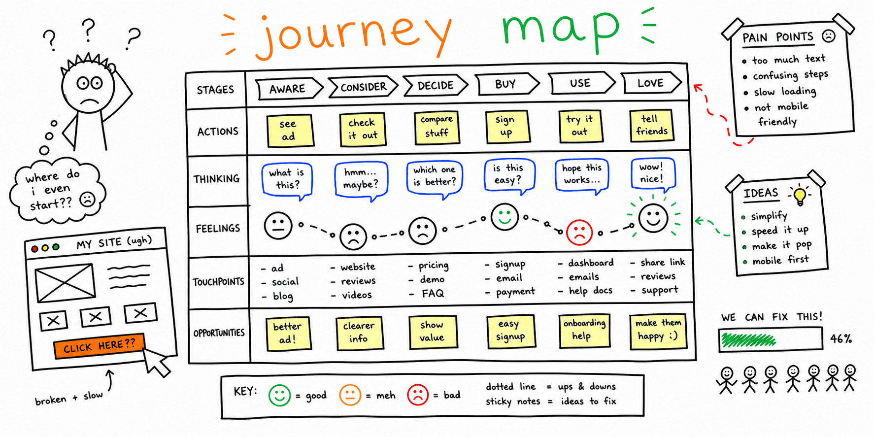
Affinity diagrams turn scattered notes into clear themes so teams can see patterns fast. This template keeps synthesis structured and easy to share.
What you'll get:
- A copy/paste affinity diagram template
- A step-by-step process
- A simple analysis checklist
Use the sections below as building blocks; keep what you need and delete the rest.
Need a research plan before synthesis? Start with the UX research plan template.
References for this guide are listed at the end.
What is an affinity diagram?
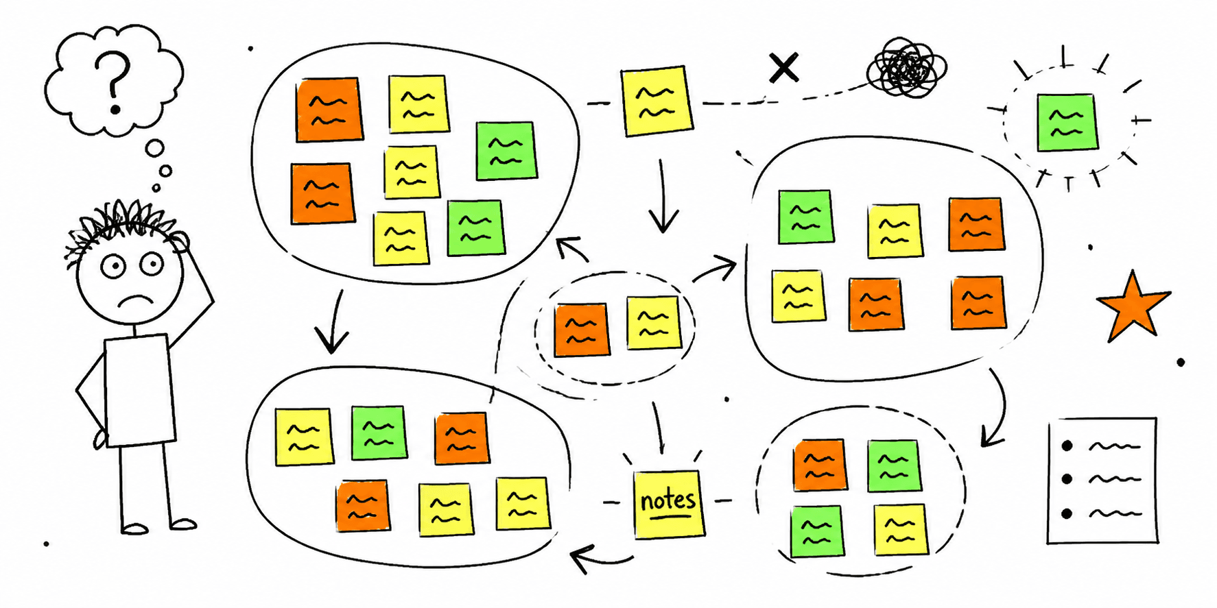
An affinity diagram is a visual tool for organizing related ideas or observations into clusters. It is used to make sense of large amounts of qualitative data and reveal patterns.
When to use affinity mapping
Affinity diagrams are useful when:
- You have lots of research notes or feedback to synthesize
- A workshop produced more ideas than you can track
- You need team alignment on themes and next steps
Affinity diagram template (copy/paste)
1. Inputs
- Research sources:
- Data types (quotes, observations, survey notes):
- Participants:
2. Raw notes
Capture one idea per note. Use exact quotes when possible.
3. Clusters
- Cluster name:
- Notes included:
- Evidence or examples:
4. Themes
- Theme label:
- Why this cluster matters:
- Related clusters:
5. Priorities
- High impact themes:
- Open questions:
- Next steps:
Step-by-step process
Nielsen Norman Group and Maze describe a simple flow:
- Generate notes (one idea per sticky note)
- Group notes into clusters
- Name clusters and prioritize next steps
Affinity diagram worksheet
| Note | Cluster | Theme | Evidence | Priority |
|---|---|---|---|---|
Mini example (filled in)
Goal: Improve onboarding flow
Notes: "Setup feels long", "Too many fields", "Not sure what comes next"
Cluster: Form friction
Theme: Reduce onboarding effort
Next step: Test a shorter form with progress cues
Analysis checklist
- Notes are written as single ideas
- Clusters are labeled clearly
- Themes connect to user goals
- Priorities and next steps are defined
FAQ
Should affinity diagrams be done as a team?
Nielsen Norman Group recommends collaborative sorting to promote discussion and alignment.
Is affinity mapping the same as card sorting?
Nielsen Norman Group notes that affinity diagramming groups research ideas, while card sorting is used to define information architecture.
What should you do after the diagram?
Miro and Nielsen Norman Group recommend prioritizing clusters and defining next steps.
References
- Nielsen Norman Group — Affinity Diagram
- Miro — Affinity Diagram
- Maze — Affinity Diagrams
- Miro — Create Affinity Diagrams
- Atlassian — Affinity Diagram
Related resources
- User interview questions template
- User interview template
- User persona template
- Card sorting template
- UX audit template
If you want a fast UX review for a specific page, start here: Website UX Audit
Want client-ready UX findings in minutes? Roast My Web generates branded PDF audit reports with prioritized UX, conversion, and SEO fixes.