Most lists of usability examples stop at generic advice. The issue: teams still do not know what to test, how to measure success, or which fix to ship first.
This guide gives you usability testing examples you can run on a real website this week, with test tasks, pass/fail metrics, and concrete fixes.
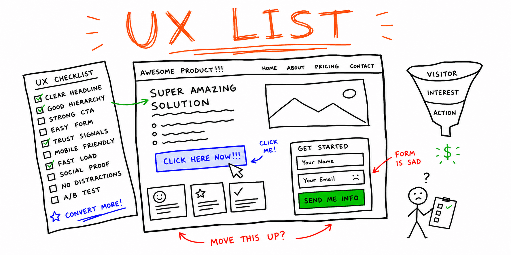
If you want a full audit pass first, start with Website Usability Test and Website UX Audit, then use the examples below to structure manual validation.
How to Use These Website Usability Testing Examples
Before you test, define:
- Primary flow: homepage -> key page -> CTA/form/checkout.
- Participant profile: who your ideal buyer or user is.
- Success metric: completion, time on task, error rate, and confidence rating.
- Severity model: P0 (blocks conversion), P1 (major friction), P2 (polish).
This turns website usability testing examples into repeatable decisions instead of opinions.
12 Usability Testing Examples (Problem -> Test -> Fix)
Use this table as a working script for moderated or unmoderated tests.
| # | Usability issue | Test task to run | Success metric | High-confidence fix |
|---|---|---|---|---|
| 1 | Value proposition is unclear above the fold | "In 5 seconds, what does this page offer and who is it for?" | At least 80% answer correctly | Rewrite hero headline + subhead with audience + outcome language |
| 2 | Primary CTA is hard to find | "Start the main action as quickly as possible." | Median time to first CTA click under 8 seconds | Increase CTA contrast, move CTA above fold, remove competing links |
| 3 | Navigation labels do not match user mental model | "Find pricing for your use case." | 90% find target page without backtracking | Rename nav items to task-based labels users actually use |
| 4 | Important page content is buried | "Compare plans and pick the best fit." | 80% can explain plan differences in under 60 seconds | Add comparison table with plain-language differences and defaults |
| 5 | Form completion drops midway | "Request a demo using realistic details." | Form completion over 70%; fewer than 1 error per user | Remove optional fields, add inline validation, add example input text |
| 6 | Error states are vague or invisible | Enter invalid data on purpose | 100% of users understand what broke and how to fix it | Replace generic errors with field-specific, action-oriented copy |
| 7 | Mobile layout hides key controls | Complete the same task on a 390px viewport | No hidden CTA; no horizontal scroll; completion delta under 10% vs desktop | Reorder sections for mobile priority; fix sticky and overflow issues |
| 8 | Trust signals are too far from decision points | "Would you submit payment/contact details here?" | Confidence score at least 4/5 before submit | Move proof near CTA: testimonials, client logos, guarantees, security notes |
| 9 | Search and filters return low-quality results | "Find a result for [common intent query]." | First relevant result within top 3 for at least 80% of sessions | Improve synonym mapping, filter defaults, and empty-state guidance |
| 10 | Confirmation is weak after action completion | Submit a form and explain next step | 100% can state what happens next | Add explicit confirmation state + expected response time + next action |
| 11 | Checkout friction around shipping/tax surprise | Reach final checkout screen | Checkout completion from start to payment above 60% in test cohort | Reveal pricing components earlier and simplify checkout steps |
| 12 | Accessibility blockers break task completion | Complete task with keyboard-only navigation | 0 critical failures in keyboard path and focus order | Repair focus order, visible focus states, labels, and semantic headings |
Copy/Paste Task Prompts for Moderated Sessions
When teams ask for website usability examples, they often also need prompts. Use these directly:
- "You just arrived here. What do you think this page wants you to do?"
- "Find the fastest way to book/request/buy."
- "You are unsure about trust. What information would you look for?"
- "Complete this form as if you were a real buyer."
- "If something feels confusing, narrate what you expected instead."
Need a full script? Use Usability Test Script Example and Usability Testing Template.
Example Findings Log (Use After Every Session)
| Issue | Evidence | Severity | Affected step | Recommended fix | Owner | ETA |
|---|---|---|---|---|---|---|
| Users miss primary CTA on mobile | Session 03, 05, 07 | P0 | Hero -> CTA | Move CTA up, increase contrast, reduce competing links | Design | 2 days |
| Demo form abandoned at phone field | Session 02, 04, 08 | P1 | Form completion | Make phone optional, add input mask guidance | Product | 3 days |
| Users cannot explain plan differences | Session 01, 06, 09 | P1 | Pricing decision | Add plain-language plan comparison block | Marketing | 4 days |
This is the fastest way to convert usability testing examples into clear implementation tickets.
Prioritization Rule That Keeps Teams Moving
Use this score per issue:
Priority = (Impact on conversion x Frequency in sessions x Confidence in evidence) / Effort
- Impact: 1-5
- Frequency: 1-5
- Confidence: 1-5
- Effort: 1-5
Ship highest score first, not loudest opinion first.
Related Guides and Checklists
- How to Conduct Usability Testing
- Website Usability Checklist
- Website UX Checklist
- UX Audit Template
- User Interview Questions Template
- Website Usability Test
- Website UX Audit
Final Takeaway
The best website usability testing examples do three things: define the test task, set a pass/fail metric, and name the exact fix. Use this page as your operating checklist, then document each issue with evidence so your team can prioritize with confidence.