A UI audit checks visual consistency, clarity, and interaction quality. Use this checklist to find friction quickly and create a clean report.
What you'll get:
- A UI audit checklist
- A copy/paste UI audit template
- A simple report outline
Use the sections below as building blocks; keep what you need and delete the rest.
If you need a journey-wide review, use the UX audit template.
References for this guide are listed at the end.
What is a UI audit?
A UI audit is a structured review of a product interface to identify visual inconsistencies, unclear interactions, and layout issues that cause friction. It focuses on how the interface looks and behaves and how easily users can complete tasks.
UI audit vs UX audit
A UI audit focuses on layout, typography, color, components, and visual consistency. A UX audit focuses on the broader user journey, usability, and outcomes. They overlap, but UI audits are narrower and more visual.
When to run a UI audit
Run a UI audit when:
- You are planning a redesign
- Visual inconsistencies are growing across pages
- Conversion or engagement drops with no clear technical cause
- You need a baseline before changing the interface
Core areas to review
A strong UI audit covers:
- Visual design and layout
- Navigation clarity
- Content clarity and CTAs
- Interaction states and feedback
- Mobile responsiveness
- Performance and speed
- Accessibility basics
- Behavior data (heatmaps, drop-offs)
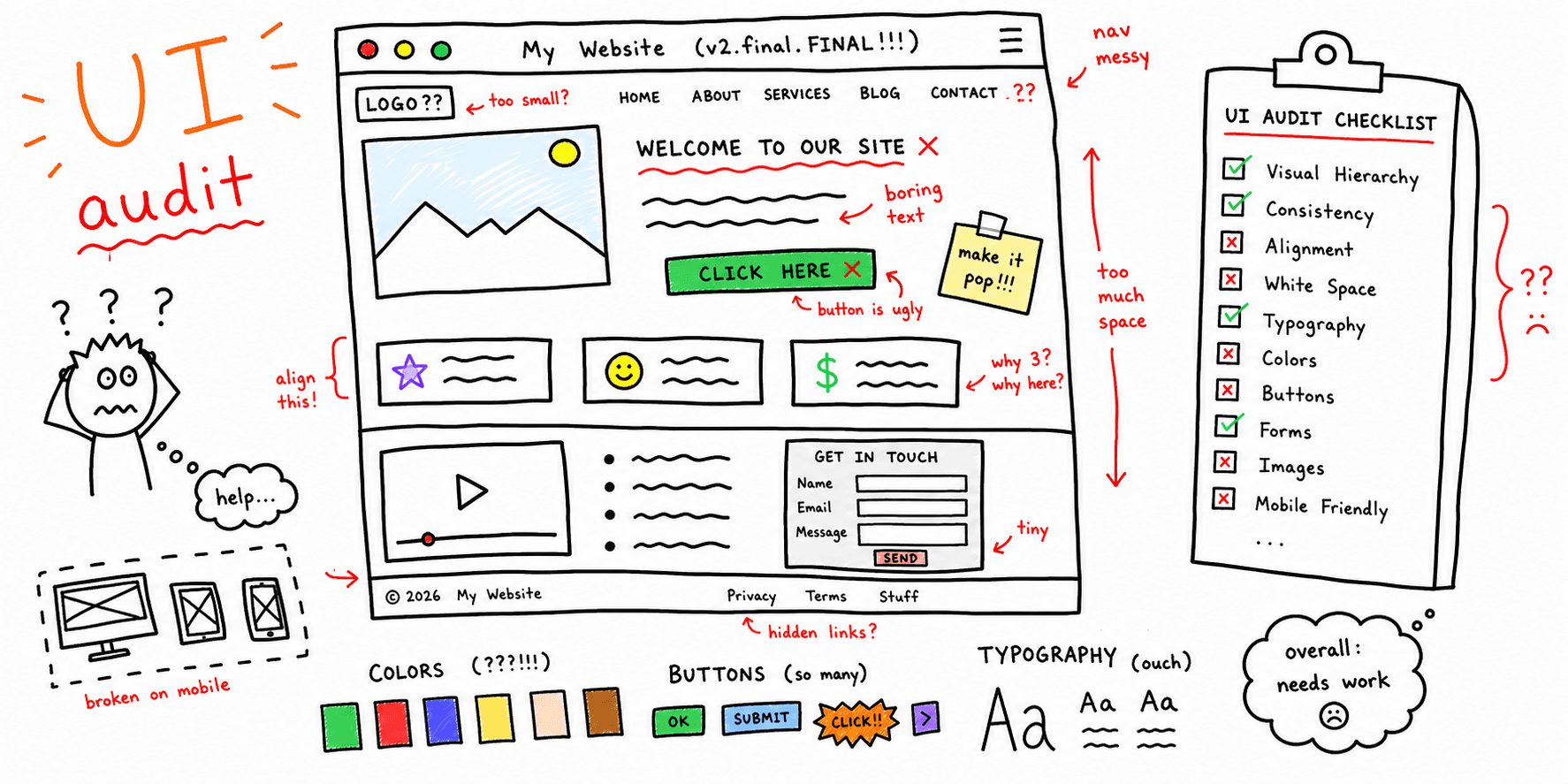
UI audit checklist
Use this checklist to keep UI reviews consistent.
Goals and scope
- Define the audit goal (conversion, clarity, brand alignment)
- Identify key pages and flows to review
- Pick the success metrics you will track
Layout and hierarchy
- Is the layout easy to scan?
- Are primary actions in expected positions?
- Is spacing consistent and purposeful?
- Are related elements grouped clearly?
Color and contrast
- Are colors consistent with the brand palette?
- Is text contrast readable?
- Do colors communicate state and priority?
- Is meaning clear without color alone?
Typography and readability
- Are fonts legible at all sizes?
- Is hierarchy clear across headings and body text?
- Are line length and spacing comfortable?
- Are styles consistent across pages?
Components and consistency
- Are buttons, forms, and icons consistent?
- Do components follow a clear pattern?
- Are interactive elements easy to identify?
- Are states consistent (hover, focus, disabled)?
Interaction feedback
- Do inputs show success, error, and loading states?
- Are error messages clear and actionable?
- Is progress visible on multi-step flows?
Responsiveness and accessibility
- Does the UI work on mobile and desktop?
- Are touch targets large enough?
- Can users navigate with keyboard and screen reader?
- Is semantic structure used for headings and lists?
Behavior and performance
- Review heatmaps and session recordings
- Identify drop-off points and confusion spots
- Check page speed and heavy assets
UI audit template (copy/paste)
Audit brief
| Section | Details |
|---|---|
| Goal | What outcome are we improving? |
| Scope | Pages, flows, devices |
| Metrics | Ex: CTR, drop-off rate, activation |
| Users | Primary personas or segments |
| Tools | Analytics, heatmaps, surveys |
Page inventory
| Page | Goal | Issues found | Priority |
|---|---|---|---|
| Pricing | Increase demo requests | CTA blends in | High |
Component inventory
| Component | Usage | Issues | Recommendation |
|---|---|---|---|
| Primary button | 12 screens | 4 variations | Standardize style |
Findings log
| Area | Issue | Evidence | Severity | Recommendation |
|---|---|---|---|---|
| Checkout | Error state is unclear | Screenshot + drop-off | High | Add inline error copy |
UI audit report outline
- Summary (top 5 findings)
- Goals and scope
- Methods and data sources
- Findings by severity
- Recommendations and examples
- Next steps and owners
Example (short)
Goal: Improve trial signup completion.
Scope: Signup and onboarding screens (desktop + mobile).
Top findings:
- Primary CTA color blends into the background
- Form labels are inconsistent across steps
- Error messages appear after users submit
Next steps:
- Increase CTA contrast and size
- Standardize labels and helper text
- Add inline validation states
FAQ
Do UI audits replace UX audits?
No. UI audits focus on the interface layer. UX audits cover the full journey.
Do UI audits need heuristics?
Heuristics help reviewers spot predictable usability issues and keep audits consistent.
What should a UI audit report include?
Include findings, evidence, severity, and recommendations so teams can act quickly.
References
- DevSquad — UI Audit
- Design for Ducks — A Complete Guide For UI Audit Checklist
- Saeloun — UI UX Audit Checklist Before Redesigning A Site
- Eleken — A Checklist For UX Design Audit Based On Jakob Nielsens 10 Usability Heuristics
- Valido — UI Audit Guide Checklist For Ecommerce


