Unlocking Inclusivity: A Comprehensive Guide
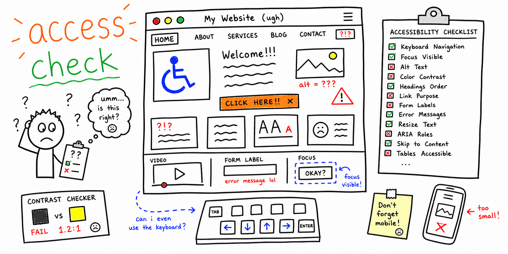
This website accessibility checklist provides eight essential steps to build inclusive online experiences. Learn how to implement keyboard navigation, alternative text for images, semantic HTML, proper color contrast, accessible forms, ARIA attributes, responsive design, and readable content. Following this checklist improves usability for everyone, boosts SEO, ensures compliance, and enhances your brand image. A website accessibility checklist empowers you to create a more inclusive web.
1. Keyboard Navigation
Keyboard navigation is a cornerstone of website accessibility, ensuring that users who cannot use a mouse can fully interact with your website. This is crucial for people with motor disabilities, visual impairments, and even those who simply prefer the efficiency of keyboard shortcuts. Making your website keyboard navigable isn't just about compliance; it significantly improves usability for a wider audience and often simplifies the development of other assistive technology interfaces. This is why it's a critical item on any website accessibility checklist.
A keyboard-accessible website allows users to navigate through all interactive elements and functionalities using only the Tab key, arrow keys, Enter key, and Spacebar. This includes links, buttons, form fields, menus, and other interactive components.
How it Works:
Keyboard navigation relies on the browser's focus management. When you press the Tab key, the focus moves sequentially through all focusable elements on the page. Visual focus indicators highlight the currently selected element, making it clear to the user where they are on the page. Users then interact with the focused element using the Enter or Spacebar keys.
Features of Effective Keyboard Navigation:
- Clear Focus Indicators: Visible outlines or other visual cues that clearly show the currently focused element. These should be at least as prominent as :hover styles.
- Logical Tab Order: The order in which elements receive focus should follow a logical, visual flow, typically from top to bottom and left to right.
- No Keyboard Traps: Users should always be able to navigate away from an element using the keyboard.
- Access to All Interactive Elements: Every interactive element, including custom widgets, must be reachable and operable via the keyboard.
Pros:
- Improved Usability for People with Disabilities: Essential for users with motor impairments who cannot use a mouse.
- Enhanced Efficiency for Power Users: Allows experienced users to navigate and interact with your website quickly using keyboard shortcuts.
- Simplified Assistive Technology Integration: Often makes it easier for screen readers and other assistive technologies to interact with your website.
Cons:
- Thorough Testing Required: Requires careful testing across different browsers and operating systems to ensure consistent functionality.
- Complex Implementation for Interactive Applications: Implementing keyboard navigation in highly dynamic and interactive applications can be challenging.
- Custom JavaScript Solutions: Some advanced interactions may require custom JavaScript solutions to manage focus and keyboard events correctly.
Examples of Successful Implementation:
- GitHub: GitHub's interface is highly navigable via keyboard, allowing users to perform complex actions using shortcuts.
- Google Docs: Provides comprehensive keyboard support for document editing, formatting, and navigation.
- Twitter: Enables keyboard navigation through tweets, replies, and other actions.
Actionable Tips:
- Test with the Tab Key: Regularly test your website using only the Tab key to ensure all interactive elements are accessible and the tab order is logical. Learn more about Keyboard Navigation for best practices.
- Use CSS
:focusStyles: Implement distinct:focusstyles in your CSS. These should be at least as visible as:hoverstates. - Implement Skip Navigation Links: Include "Skip to Main Content" links at the top of your pages to allow keyboard users to bypass repetitive navigation elements.
- Use
tabindex="0": Usetabindex="0"judiciously to include custom, non-focusable elements in the tab order. Avoid positive tabindex values as they disrupt the natural flow.
By prioritizing keyboard navigation, you create a more inclusive and user-friendly experience for everyone, aligning your website with best practices for website accessibility checklists and benefiting your entire user base.
2. Alternative Text for Images
Ensuring your website is accessible to everyone, including users with visual impairments, is crucial for both ethical and practical reasons. One of the most fundamental aspects of web accessibility is providing alternative text (alt text) for images. Alt text offers a textual description of an image's content and function, allowing screen readers to convey the information to visually impaired users. It also serves as a placeholder if an image fails to load, ensuring users still understand the context. This makes alt text a critical component of any website accessibility checklist.
Alt text should be concise yet descriptive, focusing on the image's purpose and context within the page. For instance, an image of a product might have alt text like "Red leather handbag with gold clasp," while an image illustrating a concept might have alt text like "Graph showing increasing website traffic over time." This context-specific approach ensures the alt text accurately conveys the image's meaning. Features of effective alt text include concise descriptions, contextually relevant wording, empty alt attributes (alt="") for purely decorative images, and longer descriptions for complex images like charts and graphs.
Examples of Successful Implementation:
- Wikipedia: Known for its meticulous image descriptions, providing rich context and information for visually impaired users.
- The New York Times: Uses detailed and informative alt text for news images, ensuring accessibility for all readers.
- WebAIM: Their website serves as a practical demonstration of proper alt text implementation, offering valuable learning resources.
Pros of Using Alt Text:
- Essential for Screen Reader Users: Allows visually impaired users to understand and engage with visual content.
- Improved SEO: Helps search engines understand image content, contributing to better search rankings for relevant keywords like "website accessibility checklist."
- Context When Images Fail to Load: Provides a textual alternative if an image doesn't display correctly.
Cons of Implementing Alt Text:
- Requires Careful Consideration: Crafting effective alt text requires practice and thoughtfulness.
- Potential for Oversight: Alt text fields can be overlooked in some content management systems.
- Complexity for Detailed Images: Writing comprehensive descriptions for complex images can be challenging.
Actionable Tips for Writing Effective Alt Text:
- Keep it Concise: Aim for under 125 characters in most cases.
- Focus on Purpose: Describe the image's function and context rather than every visual detail.
- Decorative Images: Use
alt=""(empty alt attribute) for purely decorative images. Do not omit the attribute entirely. - Functional Images: For buttons or other interactive elements, describe the action (e.g., "Submit form," "Add to cart").
- Test with Screen Readers: Ensure your descriptions make sense and provide value in context.
For freelance web designers, digital marketing agencies, startup founders, solo entrepreneurs, and UX/UI specialists, incorporating proper alt text is essential for building inclusive and accessible websites. By prioritizing alt text, you demonstrate a commitment to providing a positive user experience for everyone while also boosting your website's SEO performance. Resources like WebAIM and JAWS screen reader documentation, popularized by accessibility advocates, provide valuable guidance on implementing effective alt text strategies. Adding alt text to your website accessibility checklist is a simple yet powerful step towards creating a more inclusive online environment.
3. Semantic HTML Structure
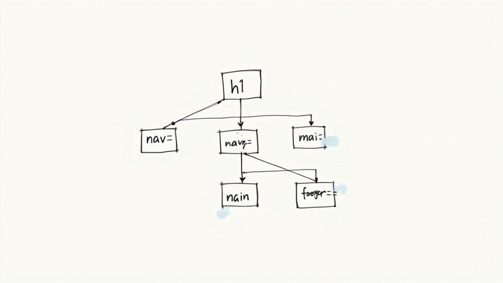
Semantic HTML is a cornerstone of website accessibility. It involves using HTML elements for their intended purpose, reflecting the meaning of content rather than simply dictating its appearance. This approach is crucial for assistive technologies like screen readers, which rely on semantic cues to understand the structure and hierarchy of a web page and convey that information effectively to users. A semantically structured website isn't just accessible; it's also better for SEO, maintainability, and cross-platform consistency.
Imagine a screen reader user navigating a website. Without semantic HTML, the screen reader might simply read out a string of text, making it difficult for the user to understand the page's organization. With semantic HTML, the screen reader can identify headings, navigation links, lists, and other structural elements, providing context and enabling users to navigate efficiently. This is why semantic HTML earns its place in any serious website accessibility checklist.
Key Features of Semantic HTML:
- Appropriate heading structure (h1-h6): Headings should reflect the hierarchical structure of the content, with a single
<h1>for the main title and subsequent headings used to denote subsections. - Semantic elements: Utilize elements like
<nav>,<main>,<aside>,<article>,<section>, and<footer>to define different parts of the page. - Lists: Properly mark up lists using
<ul>,<ol>, and<li>. - Tables: Use appropriate table markup with table headers (
<th>) and scope attributes to define row and column headers.
Pros:
- Improved screen reader navigation and comprehension: Allows assistive technologies to interpret and convey page structure effectively.
- Enhanced SEO: Search engines utilize semantic HTML to understand content, improving search rankings.
- Increased code maintainability and understandability: Well-structured code is easier to read, update, and debug.
- Consistent structure across devices and platforms: Semantic HTML ensures that content is rendered consistently across different browsers and devices.
Cons:
- Legacy systems: Older websites might rely heavily on non-semantic markup like
<div>and<span>, requiring significant refactoring to implement semantic HTML. - Refactoring effort: Updating existing codebases can be time-consuming.
- Developer training: Developers may need training on proper semantic HTML usage.
Examples of Successful Implementation:
- GOV.UK: A prime example of a website built with strict semantic HTML guidelines.
- Mozilla Developer Network (MDN) documentation: Employs comprehensive semantic markup for clear and accessible documentation.
- BBC website: Exemplifies best practices in semantic HTML structure.
Actionable Tips:
- Use a single
<h1>for the main page title and follow a logical heading hierarchy (h2-h6). - Structure content with semantic elements before applying visual styling.
- Utilize the HTML5 Outliner tool to verify and visualize your document structure.
- Ensure the reading order in the DOM (Document Object Model) matches the visual layout.
- Avoid using
<div>and<span>when a more specific semantic element is appropriate.
Why Semantic HTML Matters for You:
Whether you're a freelance web designer, a digital marketing agency, a startup founder, a solo entrepreneur, or a UX/UI specialist, prioritizing semantic HTML is essential. It ensures your websites are accessible to everyone, improves SEO, and creates a more maintainable and robust codebase. By understanding and implementing semantic HTML, you're investing in a better user experience and a more successful online presence. Semantic HTML isn't just a best practice; it's a fundamental requirement for building inclusive and effective websites in today's digital landscape. It was popularized by the HTML5 specification and strongly advocated for by accessibility experts like Steve Faulkner.
4. Color Contrast and Text Readability
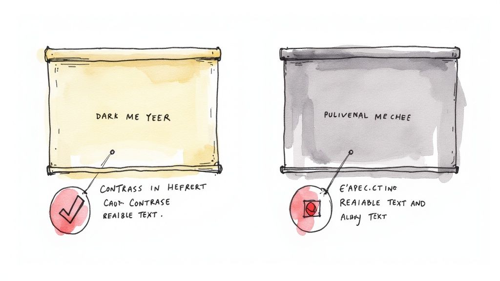
Color contrast and text readability are crucial aspects of website accessibility. Sufficient contrast between text and its background ensures that users with low vision, color blindness, or those using devices in bright environments can easily read the content. This is one of the most common accessibility issues found on websites, and addressing it significantly improves the user experience for everyone. Ignoring color contrast can effectively lock out a segment of your audience from accessing your website's information and services. This is why it's a vital component of any comprehensive website accessibility checklist.
This principle involves ensuring a minimum contrast ratio between the foreground (text and UI elements) and the background. For regular text, the Web Content Accessibility Guidelines (WCAG) recommend a minimum contrast ratio of 4.5:1. Larger text (18pt or 14pt bold) requires a minimum ratio of 3:1. It’s important to consider both body text and important UI components like buttons, form fields, and icons. Furthermore, your website should support text resizing up to 200% without loss of content or functionality. This allows users to adjust the text size to their preferred level of readability.
Pros:
- Improved Readability for All: Higher contrast benefits all users, especially those in challenging lighting conditions (e.g., bright sunlight).
- Essential for Visual Impairments: Adequate contrast is vital for users with low vision and color vision deficiencies.
- Enhanced Design & Brand Consistency: Focusing on contrast often leads to cleaner, more professional designs and can even strengthen brand identity.
Cons:
- Brand Color Conflicts: Meeting contrast requirements might require adjustments to existing brand colors.
- Implementation Challenges: Maintaining consistent contrast across all UI elements can be complex, especially in large websites.
- Ongoing Monitoring: As website content changes, contrast needs to be re-evaluated and maintained.
Examples of Successful Implementation:
- Apple: Apple's accessibility guidelines place a strong emphasis on high contrast in their user interfaces.
- U.S. Government Websites: Sites adhering to Section 508 requirements demonstrate good contrast practices.
- Stripe: Stripe's documentation showcases excellent contrast while maintaining a strong brand identity.
Actionable Tips for Implementation:
- Use Contrast Checkers: Tools like WebAIM's Contrast Checker (https://webaim.org/resources/contrastchecker/) or the Axe DevTools browser extension can help verify color contrast ratios.
- Define Accessible Color Palettes: Create design systems with accessible color palettes, including alternatives for critical brand colors that might not meet contrast requirements.
- Don't Rely Solely on Color: Use icons, patterns, or text labels in conjunction with color to convey information.
- Test in Grayscale: Viewing designs in grayscale helps identify areas where color alone is used to convey meaning.
- Consider High Contrast Modes: Offering a high contrast mode or user-adjustable themes provides greater flexibility for users.
- Lea Verou's Color Contrast Tools: Explore Lea Verou’s online tools for color contrast analysis and manipulation.
By prioritizing color contrast and text readability, you ensure a more inclusive and user-friendly experience for everyone visiting your website. This is not just about checking a box on a website accessibility checklist, it’s about building a website that truly welcomes and caters to all users. This benefits your brand image, expands your reach, and ultimately contributes to a more equitable web.
5. Form Accessibility and Labeling
Form accessibility is a critical component of any website accessibility checklist. It ensures that all users, regardless of their abilities, can effectively interact with and complete forms on your website. This is essential not just for inclusivity, but also for improving user experience and conversion rates. Inaccessible forms can create barriers for users with disabilities, leading to frustration and lost opportunities. For freelance web designers, digital marketing agencies, startup founders, solo entrepreneurs, and UX/UI specialists, understanding form accessibility is vital for creating websites that cater to everyone.
Accessible forms rely on several key features. These include explicitly associating labels with form controls using <label> elements. This connection, crucial for screen readers, ensures that users understand the purpose of each form field. Clear and concise instructions and error messages are also vital. These should provide specific guidance on how to correct any input errors. Logical grouping of related fields using <fieldset> and <legend> elements improves form comprehension and navigation, especially for complex forms. For more advanced interactions, ARIA attributes enhance the accessibility of dynamic form elements. Finally, providing proper feedback about the form's submission and processing states – whether successful or not – ensures users are aware of the form's status.
Examples of successful form accessibility implementation can be found across the web. The GOV.UK form design system adheres to strict accessibility guidelines, providing a robust example for government websites. Similarly, Google Account forms demonstrate comprehensive accessibility practices, showcasing how complex forms can be made accessible to a wide audience. Mailchimp's forms offer another excellent example, specifically in their clear labeling and effective error handling.
Pros of Accessible Forms:
- Increased form completion rates for all users: By removing barriers, accessible forms allow more users to successfully submit information.
- Improved usability with assistive technologies: Screen reader users and those navigating with keyboards can interact with the forms seamlessly.
- Reduced user errors and frustration: Clear instructions and error handling minimize confusion and improve the overall user experience.
- Enhanced overall UX for all users: Accessible forms often lead to a more intuitive and user-friendly experience for everyone, not just those with disabilities.
Cons of Accessible Forms:
- Can require more complex markup and JavaScript for validation: Implementing accessibility may necessitate more intricate coding.
- May need additional design considerations for error states: Visual design needs to accommodate clear and accessible error messages.
- Maintaining accessibility through form updates requires vigilance: Ongoing attention is needed to ensure accessibility is preserved as forms are modified.
Actionable Tips for Implementing Accessible Forms:
- Always use visible labels: Never rely solely on placeholders as labels.
- Provide specific error messages: Clearly explain how to rectify any input errors.
- Maintain form state and errors after submission attempts: Preserve user input and display error messages even after submission.
- Use appropriate input types (email, tel, date): Leverage HTML5 input types for automatic validation and improved user experience.
- Test forms with keyboard-only navigation and screen readers: Ensure usability for users who don't use a mouse.
- Include required field indicators: Use both visual cues and the
aria-requiredattribute.
Learn more about Form Accessibility and Labeling
This focus on form accessibility deserves a prominent place in any website accessibility checklist because forms are crucial interaction points for users. Ensuring they are accessible improves user experience, increases conversion rates, and fosters inclusivity. By paying attention to proper labeling, clear instructions, and assistive technology compatibility, you create forms that are usable and effective for everyone. This ultimately benefits both your users and your business objectives.
6. ARIA Implementation
ARIA, short for Accessible Rich Internet Applications, plays a crucial role in making complex web interfaces accessible to users with disabilities, particularly those who rely on assistive technologies like screen readers. It's a vital component of any comprehensive website accessibility checklist and deserves careful attention from freelance web designers, digital marketing agencies, startup founders, solo entrepreneurs, and UX/UI specialists alike. ARIA essentially bridges the gap between standard HTML and the dynamic, interactive nature of modern websites.
ARIA works by adding a set of attributes to HTML elements. These attributes provide semantic information about the element's role, state, and properties, enriching the experience for assistive technology users. When native HTML elements lack the semantic richness to convey the purpose or functionality of a component, ARIA steps in to provide the missing pieces. For example, a custom-built dropdown menu might not be inherently understandable to a screen reader as a dropdown. ARIA attributes can define its role and functionality, ensuring proper communication to the user.
Features of ARIA:
- Landmark Roles: Identify key page regions like
banner,navigation,main, andcomplementary, enabling users to navigate the structure efficiently. This allows screen reader users to quickly jump to sections of the page, rather than having to linearly traverse all the content. - Widget Roles: Define complex interactive elements such as
tabs,dialogs,sliders, andtreegrids, providing semantic meaning to custom UI components. This clarifies the function of non-standard elements. - Live Region Attributes: Announce dynamic content changes (e.g., updates to a shopping cart, new chat messages) in real-time to screen reader users. This is vital for dynamic content which might not otherwise be noticed by a screen reader.
- State and Property Attributes: Communicate the status of interactive elements (e.g.,
aria-checked,aria-disabled,aria-expanded) to screen reader users. This allows users to understand the current state of interactive elements.
Pros of Implementing ARIA:
- Enhanced Accessibility for Complex Components: Makes dynamic and custom-built interactive components accessible.
- Improved Communication of UI Changes: Informs screen reader users about real-time updates and status changes.
- Extends Native HTML Accessibility: Supplements HTML when native elements are insufficient.
- Enables Accessible Custom Controls: Allows developers to create accessible widgets and controls from scratch.
Cons of Implementing ARIA:
- Potential for Misuse: Incorrectly implemented ARIA can create more accessibility problems than it solves.
- Requires Thorough Testing: Essential to test with various screen readers and browsers to ensure consistent functionality.
- Inconsistent Implementation: Experiences can vary across different assistive technologies.
- Overuse: Often used when semantic HTML would provide a simpler and more robust solution.
Examples of Successful ARIA Implementation:
- Google Material Design components: Utilize ARIA for complex interactions within their design system.
- Adobe's Spectrum design system: Implements ARIA patterns for accessible UI components.
- Microsoft's Fluent UI framework: Incorporates comprehensive ARIA support for a wide range of interactive elements.
Tips for Effective ARIA Implementation:
- Follow the First Rule of ARIA: If native HTML can achieve the same functionality, don't use ARIA.
- Test with Multiple Screen Readers: Ensure a consistent experience across different assistive technologies (NVDA, JAWS, VoiceOver).
- Consult the ARIA Authoring Practices Guide (APG): Leverage established design patterns and best practices. (https://www.w3.org/WAI/ARIA/apg/)
- Keep ARIA Updated with JavaScript: Dynamically update ARIA attributes to reflect component state changes.
- Use
aria-liveRegions Sparingly: Avoid overwhelming users with excessive announcements.
Why ARIA Deserves Its Place in the Website Accessibility Checklist:
In today's web landscape, dynamic content and rich interactive experiences are the norm. ARIA is essential for ensuring that these advancements don't come at the expense of accessibility. By understanding and correctly implementing ARIA, web developers can create inclusive online experiences for everyone, regardless of their abilities. This is not just good practice, but essential for creating a more inclusive and accessible web. ARIA is a key component of WCAG compliance, and neglecting it can lead to accessibility violations.
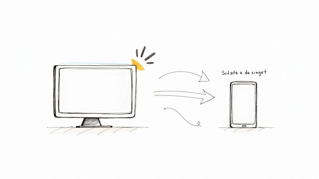
7. Responsive Design and Text Resizing
Responsive design and text resizing are crucial components of any website accessibility checklist. This approach ensures your content is usable across a wide range of devices and by users with varying needs, particularly those with visual impairments. By implementing responsive design, you make your website accessible to users regardless of their screen size, orientation, or preferred text size. This is paramount for creating an inclusive online experience and contributes significantly to a positive user experience for everyone.
Responsive design works by adapting the layout and presentation of your website content based on the user's device and settings. This dynamic adjustment is primarily achieved using CSS media queries, which apply different styles depending on factors like screen width, height, resolution, and orientation. When done effectively, responsive design creates a seamless and usable experience across desktops, laptops, tablets, and smartphones. Learn more about Responsive Design and Text Resizing to delve deeper into the technical aspects.
For users with low vision, the ability to resize text without loss of functionality is essential. A responsive design must allow text to be scaled up to at least 200% without content becoming clipped, overlapping, or requiring horizontal scrolling. This ensures users can enlarge text to a comfortable reading size without compromising the usability of the website.
Features of Accessible Responsive Design:
- Flexible Layouts: Adapts to various viewport sizes, from large desktop monitors to small smartphone screens.
- Scalable Text: Allows text resizing up to 200% without loss of content or functionality.
- Orientation Support: Works seamlessly in both portrait and landscape orientations.
- Consistent Navigation: Maintains consistent navigation and functionality across all devices and screen sizes.
- Appropriate Touch Targets: Ensures touch targets are large enough (at least 44x44 pixels) for mobile accessibility.
Pros:
- Improved Usability for Low Vision Users: Allows users to enlarge text to a comfortable size.
- Enhanced Cross-Device Compatibility: Ensures a consistent experience across diverse devices and settings.
- Support for Diverse User Preferences: Accommodates users who require specific display configurations.
- Enhanced Overall User Experience: Benefits all users by providing a more adaptable and user-friendly experience.
Cons:
- Development Time: Implementing responsive design properly can require significant development time and effort.
- Design Compromises: Complex layouts and data visualizations may require compromises for optimal responsiveness.
- Ongoing Testing: Continuous testing is necessary to ensure compatibility with new devices and screen sizes.
Examples of Successful Implementation:
- The Guardian: Maintains excellent readability at different zoom levels.
- Etsy: Adapts its interface seamlessly to text size changes.
- The Washington Post: Offers robust resizing capabilities while preserving design integrity.
Tips for Implementation:
- Use Relative Units: Utilize relative units like
em,rem, and percentages instead of fixed pixel sizes for text and layout elements. - Test Thoroughly: Test your website with browser zoom set to 200% and using text-only zoom to identify potential issues.
- Mobile-First Approach: Design with a mobile-first mindset to prioritize essential content and functionality.
- CSS Media Queries: Leverage CSS media queries based on both viewport size and user preferences to tailor the layout and styling.
- User-Controlled Font Size: Consider providing a user-controlled font size adjustment feature for enhanced accessibility.
This element deserves a prominent place in any website accessibility checklist because it directly addresses the needs of users with visual impairments and contributes to a universally positive user experience. By prioritizing responsive design and text resizing, you ensure your website is inclusive and accessible to the widest possible audience. Pioneering figures like Ethan Marcotte (responsive design) and Aaron Gustafson (adaptive web design) have significantly influenced the development and adoption of these critical practices. By implementing these techniques, you are not only adhering to accessibility best practices, but also future-proofing your website for the ever-evolving landscape of devices and user preferences.
8. Content Readability and Language
Content readability and language are crucial aspects of website accessibility. This element of a website accessibility checklist focuses on making text clear, understandable, and accessible to all users, including those with cognitive disabilities, learning differences like dyslexia, language barriers, or low literacy. By prioritizing readability, you ensure that your website's message reaches the widest possible audience and provides a positive user experience for everyone. This deserves a place on your website accessibility checklist because it directly impacts how users understand and engage with your content. Ignoring readability can exclude significant portions of your audience and limit your website's overall effectiveness.
How it Works:
Content readability involves crafting text that is easy to process and understand. This encompasses several key features:
- Clear Language Identification: Specifying the page language using the
langattribute (e.g.,<html lang="en">) helps assistive technologies like screen readers interpret the content correctly. Uselangattributes for sections of content in different languages as well. - Plain Language: Avoid jargon, technical terms, complex sentence structures, and acronyms whenever possible. If technical terms are unavoidable, provide clear definitions or a glossary.
- Consistent Navigation and Predictable Patterns: A consistent layout and predictable navigation help users understand the website's structure and find information easily.
- Meaningful Link Text: Use descriptive link text that makes sense out of context. Avoid generic phrases like "click here" or "read more."
- Support for Uncommon Words: Provide definitions or context for uncommon or specialized vocabulary.
Examples of Successful Implementation:
- GOV.UK: The UK government website is a prime example of clear and concise web writing. Their content design guidelines emphasize plain language and user-focused content.
- Mayo Clinic: The Mayo Clinic website provides complex health information in a way that is understandable to a broad audience, using clear language and avoiding medical jargon where possible.
- Hemingway Editor: This online tool helps writers simplify their prose by identifying complex sentences, adverbs, and passive voice, promoting clearer writing.
Actionable Tips for Improved Readability:
- Specify Language: Use the
langattribute in your HTML. - Target Reading Level: Aim for a reading level around 6th-8th grade for general audiences. Various tools can assess your content's reading level.
- Define Jargon: Avoid or explain industry-specific terms and acronyms.
- Structure Content: Use clear headings, short paragraphs, and bulleted lists to make content scannable.
- Provide Summaries: Condense complex information and instructions into concise summaries.
- Test Your Content: Use readability testing tools and gather user feedback to identify areas for improvement.
Pros:
- Improved comprehension for users with cognitive disabilities.
- Enhanced accessibility for users with learning disabilities like dyslexia.
- Better understanding for non-native language speakers.
- Overall improved user experience for all audiences.
Cons:
- Can be challenging for highly technical or specialized content.
- May require significant rewriting of existing materials.
- Needs ongoing content governance and editorial oversight.
When and Why to Use this Approach:
Implementing content readability best practices should be a core component of your web design process, not an afterthought. Addressing readability from the outset ensures that your website is inclusive and accessible to everyone. This approach is particularly valuable for:
- Websites with a broad audience.
- Websites providing essential information (e.g., government, healthcare, education).
- Websites aiming to maximize user engagement and conversion rates.
Popularized By:
The importance of content readability has been championed by organizations like the Plain Language Action and Information Network (PLAIN) and through the readability research conducted by the Nielsen Norman Group.
By focusing on content readability and language, you not only improve website accessibility but also create a more user-friendly and engaging experience for everyone who visits your site. This is a vital part of any comprehensive website accessibility checklist and directly contributes to a more inclusive web.
8-Point Website Accessibility Checklist Comparison
| Guideline | Implementation Complexity (🔄) | Resource Requirements (⚡) | Expected Outcomes (📊) | Ideal Use Cases (💡) | Key Advantages (⭐) |
|---|---|---|---|---|---|
| Keyboard Navigation | Medium – custom JS for focus management and testing | Low/Medium – design & cross-browser testing | Inclusive navigation and improved usability for keyboard users | Interactive apps; sites targeting motor-impaired users | Enhances accessibility and efficiency |
| Alternative Text for Images | Low – clear, concise alt text writing | Minimal – content updates | Better screen reader support and improved SEO | Image-heavy sites; informational content | Essential for conveying image context |
| Semantic HTML Structure | Medium – may require code refactoring | Low – relies on developer expertise | Improved structure, navigation, and SEO | Content-rich sites; modern web apps | Boosts maintainability and screen reader comprehension |
| Color Contrast and Text Readability | Medium – adjustments to design and testing with contrast tools | Moderate – design system updates and accessibility tools | Clear text readability and visual accessibility for diverse users | Sites with heavy text and UI components | Enhances visual clarity and consistency |
| Form Accessibility and Labeling | Medium–High – complex markup with labels, error handling, ARIA cues | High – additional markup, scripting, and rigorous testing | Higher form completion rates with reduced errors | E-commerce, government or complex data entry forms | Improves user experience and reduces user frustration |
| ARIA Implementation | High – precise attribute usage; risk of misuse | High – requires extensive testing with assistive tech | Accessible custom controls and dynamic UI communication | Dynamic interfaces; single-page or interactive applications | Fills gaps in native HTML, enabling complex interactions |
| Responsive Design and Text Resizing | Medium – flexible layouts with relative units and media queries | Moderate – design and development effort | Usability across devices with scalable text and adaptable layouts | Mobile-first and adaptable sites | Enhances overall usability and supports text scaling |
| Content Readability and Language | Low–Medium – improvements in writing and structural content | Moderate – ongoing content editing and governance | Improved comprehension and user engagement through clear language | Information-intensive platforms; public service websites | Promotes inclusive communication and clarity in messaging |
Elevating Accessibility: Next Steps
This website accessibility checklist has covered key areas for building a more inclusive online experience, from ensuring seamless keyboard navigation and providing alternative text for images, to implementing ARIA attributes and optimizing for responsive design. Mastering these concepts is crucial, not only for reaching a wider audience, including people with disabilities, but also for improving overall usability, SEO performance, and demonstrating a commitment to ethical web development. Remember, a website that is accessible to everyone benefits everyone.
Accessibility isn't a destination, it's an ongoing journey. Regular audits and updates are vital to maintaining an inclusive web presence. For freelance web designers, digital marketing agencies, startup founders, UX/UI specialists, and solo entrepreneurs, efficiently managing accessibility can be a challenge. Streamline your workflow and ensure your websites meet accessibility standards by leveraging automated tools.
Related resources
Want to simplify your accessibility audits and create professional reports effortlessly? Use the website accessibility checker to surface common issues fast, then pair it with a manual review when you need formal compliance coverage.


