
WCAG Checklist: How to Audit a Website for WCAG 2.2
Use this WCAG checklist to run a practical review of keyboard support, content structure, contrast, forms, and assistive-technology behavior. The sections map to common WCAG 2.2 failure points teams miss during redesigns and QA.
If you need a practical wcag 2.1 aa checklist, use this same seven-area flow as your baseline and then layer WCAG 2.2-only checks before release.
If you want a broader non-technical guide, start with our website accessibility checklist. When you are ready to validate pages at scale, run the website accessibility checker and then confirm legal coverage with the ADA accessibility checker.
WCAG 2.1 AA checklist vs WCAG 2.2
- Use WCAG 2.1 AA as your baseline for navigation, perceivability, readability, and form behavior.
- Add WCAG 2.2 checks for focus appearance, dragging alternatives, target size, and accessible authentication.
- Keep evidence in one worksheet by logging each issue with criterion ID, severity, page URL, and fix owner.
- If your team also needs legal framing for U.S. reviews, pair this with our ADA compliance checklist website guide.
1. Keyboard Navigation
Ensuring your website is fully navigable using only a keyboard is a cornerstone of web accessibility. This means every interactive element – links, buttons, form fields, dropdowns, and menus – must be accessible and operable without a mouse. Keyboard navigation is crucial for users with motor disabilities who may have difficulty using a mouse, those with visual impairments who navigate using screen readers and keyboard commands, and users who prefer or rely on keyboard input for faster navigation. Prioritizing keyboard accessibility significantly broadens your audience and contributes to a more inclusive online experience. This is not just about ticking a box in a WCAG checklist; it's about building a truly usable website for everyone.

Keyboard navigation relies on the user's ability to navigate through interactive elements using the Tab key. A clear visual focus indicator, such as a highlighted border or outline, must be present to show the currently active element. The order of focus should follow a logical, intuitive sequence (typically left-to-right and top-to-bottom). It's essential to avoid "keyboard traps," situations where a user can tab into an element but cannot tab out. Finally, if you implement custom keyboard shortcuts, ensure they don't conflict with common shortcuts used by assistive technologies.
Features of Effective Keyboard Navigation:
- All interactive elements accessible via the
Tabkey. - Clearly visible visual focus indicators.
- Logical keyboard focus order.
- No keyboard traps.
- Custom keyboard shortcuts that don't conflict with assistive technologies.
Pros:
- Enables access for users with motor disabilities.
- Improves the experience for power users who prefer keyboard shortcuts.
- Often improves the overall UI/UX design by encouraging a more structured layout.
- Meets WCAG 2.1 Success Criterion 2.1.1 (Keyboard), crucial for compliance and avoiding accessibility-related legal issues.
Cons:
- Implementing robust keyboard navigation can be challenging with complex interactive components.
- It may require additional development time and testing.
- Some third-party widgets or plugins might not inherently support keyboard navigation, requiring additional workarounds or custom code.
Examples of Excellent Keyboard Navigation:
- GitHub: Their interface allows complete navigation via keyboard, including complex features like issue management and code review.
- Google Docs: Provides extensive keyboard shortcuts and navigation options for document creation and editing.
- GOV.UK: The UK Government Digital Service sites are exemplary for their commitment to accessibility, including seamless keyboard navigation.
Tips for Implementing Keyboard Navigation:
- Test thoroughly with the
Tab,Enter,Space, and arrow keys. - Use
tabindexappropriately. Avoidtabindexvalues greater than 0, as this can disrupt the natural tab order. - Use browser developer tools to audit and visualize the keyboard focus order.
- Consider adding "skip links" to bypass repetitive navigation sections (e.g., skipping directly to the main content).
- Learn more about Keyboard Navigation This resource provides valuable insights into best practices for website navigation, including keyboard accessibility considerations.
Keyboard navigation deserves a prominent place on any WCAG checklist because it's fundamental to inclusive design. For freelance web designers, digital marketing agencies, startup founders, solo entrepreneurs, and UX/UI specialists, incorporating keyboard navigation is not just a best practice, it's a necessity for reaching a wider audience and delivering a positive user experience for all.
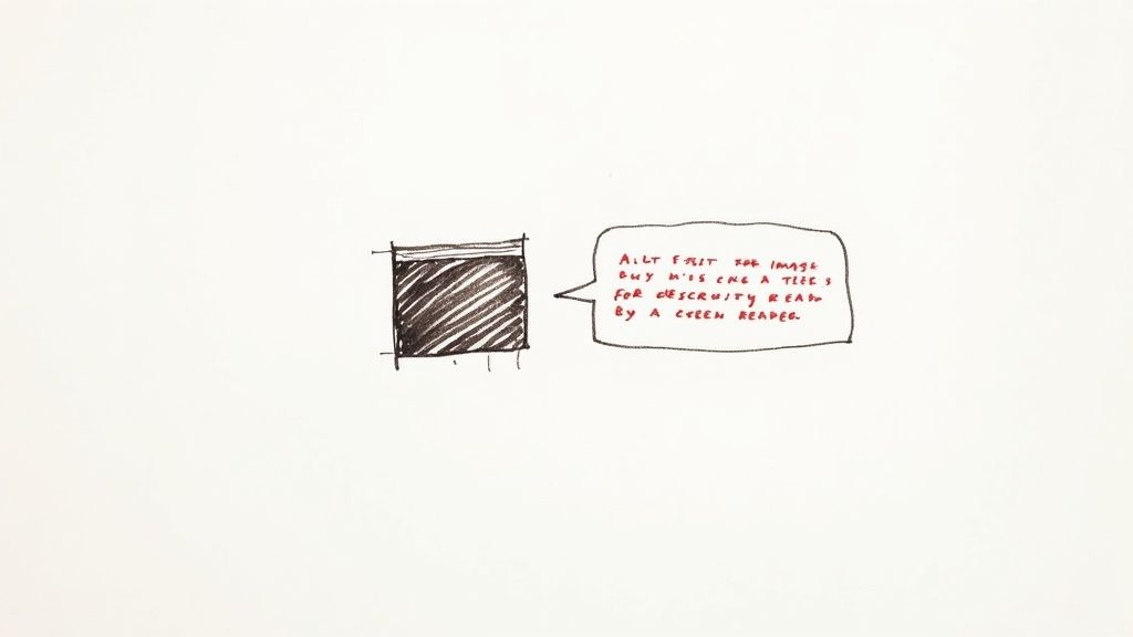
2. Alternative Text for Images
Alternative text (alt text) is a fundamental aspect of website accessibility. It provides textual descriptions for images, enabling screen readers to convey the content and purpose of images to users who are blind or visually impaired. Without alt text, these users would miss out on crucial information. Properly implemented alt text not only enhances accessibility but also improves SEO and provides a fallback when images fail to load. This makes it a crucial element in any WCAG checklist.
There are different approaches to implementing alt text depending on the image's purpose. For informative images, the alt text should concisely describe the image's content and its relevance to the surrounding text. For decorative images that add visual appeal but don't convey essential information, an empty alt attribute (alt="") should be used. Context is key; the alt text should seamlessly integrate with the surrounding content to provide a coherent user experience. More complex images like charts or graphs may require longer descriptions, which can be provided through extended descriptions linked to the image.
Features of Effective Alt Text:
- Descriptive: Accurately portrays the content and purpose of the image.
- Context-Appropriate: Integrates smoothly with the surrounding text.
- Concise: Typically under 125 characters.
- Supports Complex Images: Allows for extended descriptions when necessary.
Pros:
- Accessibility: Essential for users with screen readers.
- Fallback: Displays if images fail to load.
- SEO: Provides context for search engines.
- Easy Implementation: Relatively simple to add to HTML.
Cons:
- Often Overlooked: A common accessibility oversight.
- Writing Effective Alt Text: Can be challenging to write concise yet descriptive text.
- Maintenance: Requires ongoing attention as content evolves.
Examples of Good Alt Text Implementation:
- Wikipedia: Known for its thorough and informative image descriptions.
- The New York Times: Provides detailed alt text for news photographs, painting a picture for visually impaired readers.
- Microsoft's Accessibility Documentation: Offers exemplary alt text practices and guidelines.
Tips for Writing Effective Alt Text:
- Be Concise: Aim for under 125 characters.
- Focus on Purpose: Describe the image's function in context.
- Empty Alt for Decorative Images: Use
alt=""for purely visual elements. - Avoid Redundancy: Skip phrases like "image of" or "picture of."
- Complex Images: Use extended descriptions for charts, graphs, etc.
Popularized By:
- Web Accessibility Initiative (WAI): Sets international standards for web accessibility.
- JAWS Screen Reader Requirements: Influences alt text best practices.
- WebAIM (Web Accessibility In Mind): Provides valuable resources and training on web accessibility.
For freelance web designers, digital marketing agencies, startup founders, solo entrepreneurs, and UX/UI specialists, understanding and implementing proper alt text is not just good practice- it's essential for creating inclusive and accessible websites for everyone. By following these guidelines, you can significantly improve the user experience for visually impaired users and contribute to a more accessible web.
3. Semantic HTML Structure
Semantic HTML is a cornerstone of website accessibility and a crucial item on any WCAG checklist. It involves using the correct HTML elements for their intended purpose – to structure content and give it meaning, rather than simply for visual presentation. This creates a logical document outline that assistive technologies, such as screen readers, can interpret. Consequently, users with disabilities can understand the relationships between different parts of a webpage and navigate more efficiently. Without proper semantic structure, navigating a website with a screen reader can be like trying to read a book with all the page numbers ripped out.
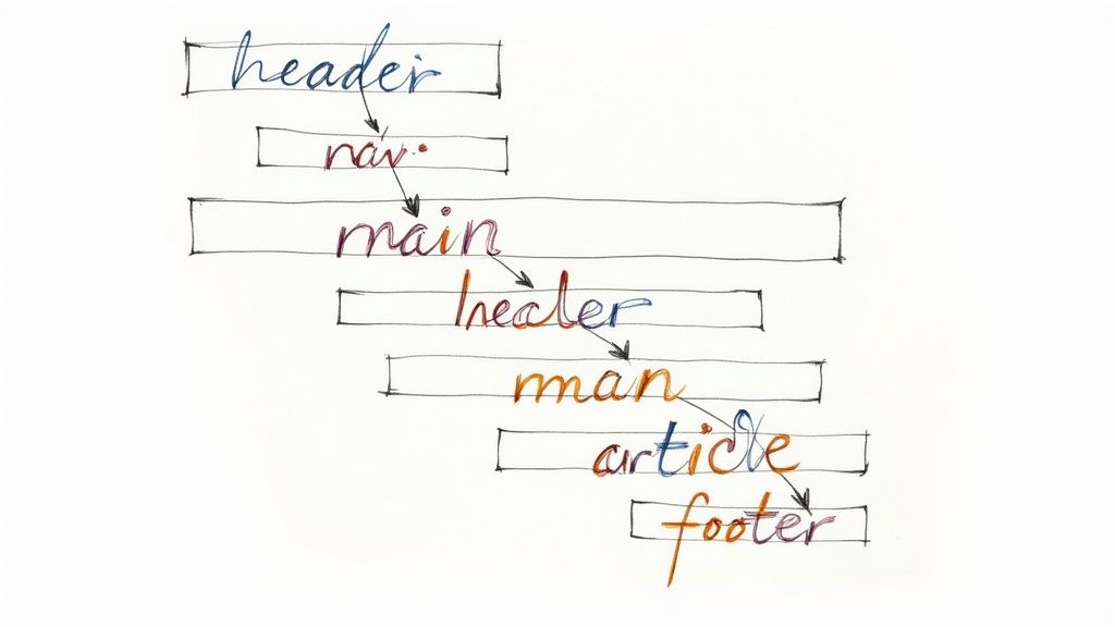
Semantic HTML provides a foundation upon which all other accessibility features are built. It features the appropriate use of heading levels (<h1>-<h6>) in hierarchical order, creating a clear document outline. It utilizes semantic elements like <nav>, <main>, <article>, and <section> to define the different parts of a page. Further, it employs proper use of lists (<ul>, <ol>, <dl>) for grouped content and ensures form elements have correct semantics and associations for easy interaction. Finally, it allows developers to use ARIA landmarks to supplement HTML5 semantics when needed, providing even more context for assistive technologies.
This approach offers a multitude of benefits. It drastically improves screen reader navigation and comprehension, enabling users with visual impairments to access and understand your content effectively. It also creates a clear content hierarchy for all users, improving overall usability. As a bonus, semantic HTML often improves SEO because search engines can better understand the structure and content of your website. It also makes your code more maintainable and future-proof, simplifying updates and redesigns. Furthermore, content structured with semantic HTML works well with browser reading modes, providing a cleaner and more focused reading experience.
While the benefits are significant, there are some potential drawbacks to consider. Implementing semantic HTML properly requires developer knowledge and discipline. Legacy systems may be built using non-semantic approaches, requiring significant refactoring to update. Finally, semantic HTML can sometimes conflict with certain design requirements if not planned carefully from the outset.
Examples of successful implementation abound. The BBC's website, Mozilla Developer Network (MDN) documentation, and even the W3C's own websites demonstrate best practices in semantic HTML. These sites showcase how structure and accessibility can be seamlessly integrated with modern web design.
Tips for Implementing Semantic HTML:
- Use a single
<h1>element for the main page title. - Don't skip heading levels (e.g., go from
<h2>to<h4>). - Use HTML5 sectioning elements (
<article>,<aside>,<nav>,<section>) to create logical content groups. - Use ARIA landmarks to enhance semantics when needed.
- Test your document outline with screen readers or specialized tools.
Learn more about Semantic HTML Structure as it pertains to information architecture. This resource provides valuable insights into organizing your website content for optimal user experience and accessibility.
For freelance web designers, digital marketing agencies, startup founders, solo entrepreneurs, and UX/UI specialists, understanding and implementing semantic HTML is essential for creating inclusive and accessible websites. By prioritizing semantic structure, you ensure that your website is usable by everyone, regardless of their abilities, while simultaneously improving SEO, maintainability, and overall user experience. This fundamental principle, popularized by the HTML5 specification, accessibility advocates like Steve Faulkner, and the Web Accessibility Initiative (WAI), should be a top priority in modern web development.
4. Color Contrast and Visual Design
Color contrast and visual design are crucial aspects of website accessibility. Proper color contrast ensures that text and interactive elements are distinguishable for users with visual impairments, including low vision, color blindness, or those using devices in challenging lighting conditions. This involves maintaining sufficient contrast ratios between text and background colors, avoiding using color as the sole means of conveying information, and ensuring all visual elements are perceivable by everyone. Ignoring color contrast can effectively lock out a significant portion of your audience from accessing and understanding your content. Therefore, incorporating robust color contrast considerations is a fundamental element of any comprehensive WCAG checklist.

This principle revolves around achieving and maintaining specific minimum contrast ratios: 4.5:1 for normal text and 3:1 for large text (14pt bold or 18pt regular). Color-independent design is equally critical, meaning your website shouldn't rely solely on color to convey meaning. Think of traffic lights – while color differentiates them, their position also reinforces their meaning. Similarly, your site should utilize text labels, patterns, or icons in conjunction with color. Other key features include visible focus indicators for interactive elements (so users know what element has keyboard focus), scalable text that remains readable when enlarged, and support for high contrast mode and other user-defined display preferences.
Examples of Successful Implementation:
- Stripe's documentation: Stripe offers a fantastic example of excellent contrast throughout its interface, ensuring readability and ease of navigation for all users.
- Apple's website: Apple is known for its commitment to accessibility, and their website showcases their adherence to accessibility guidelines, including robust color contrast implementation.
- The Contrast Rebellion: This movement actively promotes good color contrast practices in web design, offering resources and inspiration for creating accessible and visually appealing websites.
Pros:
- Increased readability for users with low vision or color vision deficiencies.
- Improved usability in diverse lighting conditions or on low-quality displays.
- Often leads to a cleaner, more professional overall design.
- Ensures information is perceivable through multiple channels, reinforcing understanding.
Cons:
- May restrict some brand color choices.
- Designers might need to compromise on certain visual aesthetics to prioritize accessibility.
- Requires ongoing testing and adjustments as content changes and evolves.
Actionable Tips for Implementation:
- Utilize Contrast Checkers: Tools like the WebAIM Contrast Checker or browser developer tools help you quickly and easily assess the contrast ratios of your text and background colors.
- Supplement Color with Other Visual Cues: Always provide text labels, patterns, or icons alongside color-based information.
- Test in Grayscale: Viewing your site in grayscale helps identify elements that rely solely on color for conveying meaning.
- Ensure Visible Focus Indicators: Focus indicators should have at least a 3:1 contrast ratio against the surrounding background.
- Consider Offering Customizable Themes: Providing high contrast or alternative color themes caters to users with diverse visual needs.
When and Why to Use This Approach:
Implementing proper color contrast should be a foundational consideration from the very beginning of your website design and development process. It's not an afterthought or a "nice-to-have" but a core requirement for ensuring inclusivity and providing equal access to information for all users. This approach is particularly beneficial for freelance web designers, digital marketing agencies, startup founders, solo entrepreneurs, and UX/UI specialists aiming to create user-friendly and accessible websites that cater to a broader audience. By prioritizing color contrast and visual design accessibility, you not only enhance usability but also contribute to a more inclusive and equitable online experience for everyone.
5. Form Accessibility and Error Handling
Form accessibility is a crucial aspect of WCAG checklist compliance, ensuring that all users, regardless of ability, can easily input data, understand requirements, and correct errors efficiently. This is essential for a positive user experience and contributes significantly to a truly inclusive website. For freelance web designers, digital marketing agencies, startup founders, solo entrepreneurs, and UX/UI specialists, prioritizing form accessibility is not just good practice, it's good business.
This involves much more than simply having forms that "work." It requires careful consideration of how users with various disabilities interact with forms, including those using screen readers, keyboard navigation, or those with cognitive impairments. A well-designed, accessible form provides a seamless and frustration-free experience for everyone.
How Accessible Forms Work:
Accessible forms utilize several key features to ensure usability:
- Properly Associated Labels: Every form control (input field, checkbox, radio button, etc.) must have a clearly associated label using the
<label>element and theforattribute, connecting it to the corresponding input'sid. This allows assistive technologies to announce the label to users when the input is focused. - Clear Instructions and Placeholder Text: Concise instructions and helpful placeholder text within the input fields guide users on the expected input format and any specific requirements.
- Error Identification and Suggestions for Correction: When errors occur, clear and informative error messages should be provided, explaining the issue and suggesting how to correct it. These messages should be programmatically associated with the relevant form field.
- Accessible Form Validation: Validation should be performed in a way that is accessible to assistive technologies. Error messages should be announced and their location clearly indicated.
- Logical Tab Order and Keyboard Operability: Users should be able to navigate through the form using only the keyboard, following a logical and predictable tab order.
- Appropriate ARIA Attributes (for Complex Forms): For more complex forms, ARIA attributes can provide additional semantic information and improve the experience for assistive technology users.
Examples of Successful Implementation:
- Gov.UK's form design system: Provides a robust and well-documented example of accessible form design.
- Mailchimp: Their sign-up and creation forms demonstrate good accessibility practices.
- SurveyMonkey: Offers accessible survey creation tools, allowing users to create accessible forms for data collection.
Pros:
- Improved Usability for Everyone: Accessible forms are easier for everyone to use, not just users with disabilities.
- Reduces Form Abandonment and Increases Conversion Rates: By removing barriers, accessible forms encourage completion, leading to higher conversion rates.
- Makes Complex Data Entry Tasks More Manageable: Clear instructions and error handling simplifies complex forms.
- Prevents Frustration and Cognitive Overload: A well-designed form reduces user frustration and improves the overall user experience.
Cons:
- Can Require More Development Time for Proper Implementation: Building truly accessible forms requires attention to detail and thorough testing.
- May Conflict with Minimalist Design Trends: Sometimes, providing all necessary information for accessibility might seem to clash with minimalist aesthetics. However, with careful planning, both can be achieved.
- Complex Validation Requires Careful Planning and Testing: Ensuring accessible validation requires careful consideration of how error messages are presented and conveyed to users.
Tips for Implementing Accessible Forms:
- Always use
<label>elements properly associated with inputs. - Provide clear error messages that explain how to fix problems.
- Use fieldsets and legends to group related form elements.
- Ensure error messages are announced by screen readers.
- Test forms with keyboard-only navigation.
- Provide both visual and non-visual cues for required fields (e.g., an asterisk and ARIA attributes).
Popularized By:
- Adam Silver (Form Design Patterns book)
- Heydon Pickering (Inclusive Components)
- The Nielsen Norman Group's form usability research
Including form accessibility in your WCAG checklist is not just a best practice; it's a necessity for creating an inclusive and user-friendly online experience. By following these guidelines, you can ensure your forms are accessible to everyone, boosting usability and contributing to a more equitable web.
6. Responsive Design and Text Resizing
Responsive design and text resizing are crucial aspects of a WCAG checklist, ensuring your content remains usable and accessible across a wide range of devices and user preferences. This means your website should adapt seamlessly to different screen sizes, from large desktop monitors to small smartphone displays, and function flawlessly even when users increase text size for better readability. This is essential for reaching a wider audience and providing an inclusive online experience, a key concern for freelance web designers, digital marketing agencies, startup founders, solo entrepreneurs, and UX/UI specialists alike.
In essence, responsive design utilizes fluid layouts and flexible elements that adjust dynamically based on the user's viewport. Text resizing capabilities, on the other hand, allow users to enlarge text up to 200% without losing content or functionality. These two features work in tandem to create a user-friendly experience regardless of the device or user's visual needs.
Features of accessible responsive design and text resizing include:
- Flexible layouts: Layouts that adapt to different viewport sizes.
- Accessible enlarged text: Content remains accessible and usable even when the text is significantly enlarged.
- No horizontal scrolling: Avoids horizontal scrolling at standard screen widths when text is resized.
- Touch-friendly targets: Ensures interactive elements are easily tappable on touchscreens.
- Orientation support: Supports both portrait and landscape screen orientations.
- User font preferences: Respects user-defined font sizes in browsers.
Why is this important for website accessibility? Consider users with low vision who rely on larger text sizes to access online content. Responsive design coupled with text resizing empowers these individuals to use your website effectively. Furthermore, it improves usability across different devices and contexts, contributing to a better user experience for everyone. Learn more about Responsive Design and Text Resizing to understand its impact on mobile-friendliness.
Pros:
- Benefits users with low vision: Larger text improves readability for users with visual impairments.
- Enhanced cross-device usability: Content remains accessible and functional across various devices.
- Future-proof design: Creates a robust design that adapts to emerging technologies.
- Reduced maintenance costs: Often leads to lower maintenance costs through a unified codebase.
Cons:
- Increased design/testing complexity: Requires more thorough design and testing processes.
- Potential visual compromises: May require compromises on certain visual elements for optimal responsiveness.
- Challenging retrofitting: Difficult to implement on older, legacy websites.
Examples of Successful Implementation:
- The Guardian: Maintains readability and usability across all devices.
- Etsy: Product pages adapt seamlessly to different text sizes, ensuring accessibility.
- Microsoft (Fluent Design System): Microsoft's websites effectively implement responsive design principles.
Actionable Tips for Implementation:
- Use relative units: Employ relative units like
em,rem, and percentages instead of fixed pixels for font sizes and layout dimensions. - Test with text zoom: Regularly test your website with text zoom set to 200% in different browsers.
- Ensure touch target size: Make sure touch targets are at least 44x44 pixels for easy interaction on touchscreens.
- Consider layout reflow: Think about how your layout reflows and adapts when screen real estate is limited.
- Test with browser font settings: Test your website with different browser font size settings.
- Use CSS media queries: Leverage CSS media queries to adapt layouts based on viewport size and other device characteristics.
Pioneering figures who have popularized responsive web design include Ethan Marcotte (who coined the term "responsive web design"), Luke Wroblewski (known for his mobile-first approach), and Rachel Andrew (a CSS Grid expert). Their work has significantly shaped the landscape of modern web development and emphasized the importance of responsive design and accessibility. By incorporating these principles, you can create websites that are both user-friendly and accessible to a broader audience.
7. ARIA Implementation and Screen Reader Support
Ensuring your website is accessible to everyone, including users with disabilities, is crucial for inclusivity and legal compliance. A key aspect of website accessibility is proper implementation of Accessible Rich Internet Applications (ARIA). This element of your WCAG checklist focuses on how ARIA attributes can enhance screen reader support, making your content perceivable and navigable for users who rely on assistive technologies.
ARIA, which stands for Accessible Rich Internet Applications, is a set of attributes that define ways to make web content and applications more accessible to people with disabilities, particularly those using screen readers. It essentially bridges the gap between standard HTML semantics and the dynamic, interactive nature of modern web applications. Without proper ARIA, complex widgets, custom controls, and dynamic content updates can be completely invisible or incomprehensible to screen reader users.
How ARIA Works:
ARIA attributes are added to HTML elements to provide additional semantic information that screen readers can interpret. This includes:
- ARIA Landmarks (role attributes): Define regions of a page (e.g.,
role="navigation",role="main",role="search") allowing users to quickly navigate to key sections. - ARIA States and Properties: Convey the current status of interactive elements (e.g.,
aria-checked="true"for a checkbox,aria-disabled="true"for a disabled button). - Live Regions (
aria-live): Announce dynamic content updates to screen reader users without requiring them to manually navigate to the changed content. This is critical for things like real-time notifications or loading indicators. - ARIA Labels and Descriptions (
aria-label,aria-describedby): Provide additional context and labels for elements that might not have clear semantic meaning from their standard HTML attributes. This is particularly important for custom components.
Benefits of Proper ARIA Implementation:
- Enables complex interactive features to be accessible: ARIA makes rich internet applications usable for people who rely on assistive technologies.
- Bridges gaps in native HTML semantics: Provides a way to add semantic meaning where standard HTML is insufficient.
- Provides better context and information to screen reader users: Offers a richer browsing experience for those who cannot perceive visual cues.
- Allows for dynamic content to be perceived by assistive technology: Ensures that changes on the page are announced to users.
Potential Drawbacks of ARIA:
- Incorrect implementation can be harmful: Misusing ARIA can create more accessibility problems than it solves.
- Requires thorough testing with actual screen readers: Simulations aren't enough; testing with real users and assistive technology is essential.
- Varying support across assistive technologies: While support is generally good, discrepancies can exist.
- Adds complexity to development: Requires careful planning and implementation.
Examples of Successful ARIA Implementation:
- Google's Material Design components: Google has invested heavily in accessible components with robust ARIA implementation.
- Adobe's Spectrum design system: Offers detailed ARIA patterns for its components.
- The Accessible University demo site: Showcases practical examples of proper ARIA usage.
Actionable Tips for Implementing ARIA:
- Follow the "First Rule of ARIA": If you can use a native HTML element (e.g.,
<button>,<nav>) that already provides the semantics you need, do not use ARIA. - Keep ARIA implementations simple and focused on real user needs. Don't over-engineer.
- Use
aria-liveregions sparingly and appropriately. Overuse can lead to a noisy and confusing experience. - Test with multiple screen readers (NVDA, JAWS, VoiceOver) on different platforms.
- Stay updated on ARIA authoring practices from W3C: Best practices evolve, so staying current is essential.
Why ARIA is Essential for Your Website Accessibility Checklist:
ARIA implementation is crucial for creating truly inclusive web experiences. By providing the necessary information to assistive technologies, you ensure that everyone can perceive, understand, and interact with your content. For freelance web designers, digital marketing agencies, startup founders, solo entrepreneurs, and UX/UI specialists, understanding and implementing ARIA is no longer optional- it's a fundamental requirement for building accessible and user-friendly websites. Neglecting ARIA can result in excluding a significant portion of your potential audience and potentially lead to legal issues.
7-Point WCAG Checklist
| Checklist Item | Implementation Complexity 🔄 | Resource Requirements ⚡ | Expected Outcomes 📊 | Ideal Use Cases 💡 | Key Advantages ⭐ |
|---|---|---|---|---|---|
| Keyboard Navigation | Medium - challenging with complex components | Moderate - development time and testing | Enhanced accessibility for motor/vision-impaired users | Websites with complex interactions or requiring full keyboard use | Improves UI/UX, meets WCAG 2.1 keyboard criteria |
| Alternative Text for Images | Low - relatively simple to implement | Low - mainly content writing and review | Better screen reader support and SEO | Sites with many images, especially informative or critical visuals | Essential accessibility feature, improves SEO |
| Semantic HTML Structure | Medium - requires developer knowledge and discipline | Moderate - coding best practices and audits | Clear content hierarchy; better screen reader navigation | Content-heavy sites needing logical structure | Improves SEO, maintainability; foundational accessibility |
| Color Contrast and Visual Design | Low to Medium - requires design/testing adjustments | Moderate - use of tools and iterative testing | Improved readability for low vision and color blindness | Sites aiming for broad visual accessibility and branding | Enhances usability, professional look, meets contrast WCAG |
| Form Accessibility and Error Handling | Medium - requires careful implementation and testing | Moderate to High - development and validation | Reduced errors and abandonment, improved usability | Data entry forms, sign-ups, surveys | Improves conversion, supports all users, reduces frustration |
| Responsive Design and Text Resizing | Medium - complex design and testing | Moderate - ongoing testing and adaptation | Usability across devices and for enlarged text needs | Mobile-first sites and those targeting diverse devices | Future-proof design, benefits low vision users |
| ARIA Implementation and Screen Reader Support | High - complex and requires thorough testing | High - development and extensive assistive tech testing | Enhanced access for dynamic/custom UI components | Apps with custom widgets and dynamic content | Extends native HTML accessibility, improves screen reader UX |
Next Steps After This WCAG Checklist
This WCAG checklist has covered crucial elements for creating an inclusive online experience, from keyboard navigation and alternative text for images to semantic HTML, color contrast, form accessibility, responsive design, and ARIA implementation. Mastering these aspects isn't just about checking boxes; it's about building a website that welcomes everyone, regardless of their abilities. By prioritizing accessibility, you're not only expanding your potential audience but also demonstrating a commitment to ethical and inclusive design practices. Remember, a truly successful website is one that is usable and enjoyable for all.
For freelance web designers, digital marketing agencies, startup founders, UX/UI specialists, and solo entrepreneurs, understanding and implementing these accessibility guidelines is paramount to building a positive brand reputation and reaching a wider customer base. These best practices ensure compliance with accessibility standards, enhance user experience, and contribute to a more equitable digital world.
Related resources
- Website accessibility checklist
- ADA compliance checklist website
- Website UX checklist
- Website maintenance checklist
- Website accessibility checker
- ADA accessibility checker
Implementing a repeatable WCAG checklist process helps your team ship accessible releases with fewer regressions. Start with a fast automated pass in the website accessibility checker, then use this manual checklist and the ADA accessibility checker for compliance-focused remediation.


