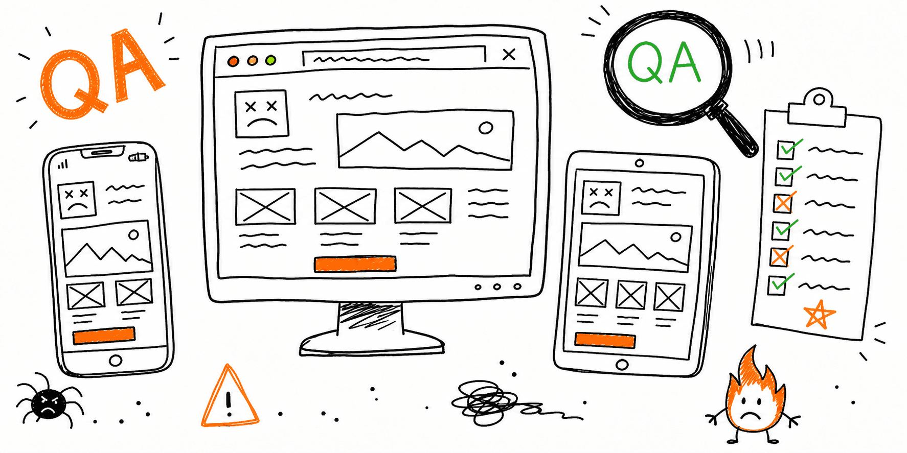
If you need to check website on different devices quickly and still catch real conversion blockers, use this workflow.
It is built for product teams, marketers, and agencies who need practical pass/fail checks, not a giant QA process that never ships.
This page focuses on device-level validation. For adjacent workflows:
- Use Cross Browser Testing Tools for browser-platform selection.
- Use check website on different browsers when you need a manual browser QA workflow.
- Use web browser test online when you need cloud/browser-session testing options.
- Use Mobile Website Testing for mobile-only deep testing.
- Use Website Quality Assurance Testing Checklist for full release QA governance.
20-Minute Workflow To Test Website on Different Devices
Use this sequence before every launch, redesign, or major template change:
- Pull your top 5 templates and top 3 conversion journeys.
- Build a small device matrix from analytics (not guesses).
- Run a first-pass scan with Website Checker.
- Manually verify journeys on real devices (or reliable cloud sessions).
- Run Core Web Vitals Test and Site Performance Audit on priority pages.
- Log issues by severity (
P0,P1,P2) and assign owners before sign-off.
This flow covers the core intent behind both "check website on different devices" and "test website on different devices."
Build the Right Device Matrix (Without Wasting Time)
Testing every possible device is impossible. Use traffic share + business risk to prioritize.
| Tier | Include | Why it belongs in your run |
|---|---|---|
| Tier 1 | Top 2 mobile devices + top desktop/browser combo | Covers most traffic and core revenue paths |
| Tier 2 | One iOS + one Android device outside top 2 | Catches layout/input edge cases |
| Tier 3 | One tablet + one low-power mobile profile | Validates responsive and performance stress |
If your site has heavy mobile traffic, always include a dedicated run from Mobile Friendly Test.
24-Point Device Compatibility Checklist
Use these as strict pass/fail checks.
1) Layout and Readability (6 checks)
- No horizontal scrolling on key pages.
- Hero, value prop, and primary CTA stay visible above fold on mobile.
- Navigation and sticky elements do not overlap content.
- Font sizes and line height remain readable on 360px and 390px widths.
- Modal, drawer, and toast layers stack correctly.
- No CLS jumps when images or embeds load.
2) Interaction and Forms (7 checks)
- Tap targets are large enough and not overlapping.
- Form fields show the correct keyboard type on mobile.
- Required/error states are readable and keyboard-accessible.
- Dropdowns, date pickers, and masked inputs work on iOS + Android.
- Primary CTA path completes without dead ends.
- Autofill does not break layout or validation.
- Consent banner choices do not block essential interactions.
For usability-specific checks, pair this with Website Usability Checklist and Website Usability Test.
3) Performance and Stability (6 checks)
- LCP is acceptable on top landing and conversion pages.
- INP stays responsive during form and menu interactions.
- Core scripts do not block first interaction.
- Heavy images are compressed and sized per breakpoint.
- Third-party tags are deferred or removed when unnecessary.
- No memory or crash behavior during 3-5 minute user journeys.
4) SEO + Accessibility Basics (5 checks)
- Canonical and index directives are correct on mobile templates.
- Metadata remains valid after responsive template changes.
- Internal links are tappable and crawlable.
- Keyboard focus states remain visible on interactive elements.
- Contrast and heading structure remain compliant on small screens.
Pair this step with Website SEO Audit Checklist and Website Accessibility Checklist.
Tool Stack by Testing Depth
| Testing depth | Use this | Best for |
|---|---|---|
| Fast pre-check | Website Checker + browser device mode | Quick detection before manual QA |
| Workflow QA | Real devices + Website Usability Test | Conversion-path validation |
| Technical validation | Core Web Vitals Test + Site Health Check | Performance and technical blockers |
| Release sign-off | Website Launch Checklist + Website Quality Assurance Testing Checklist | Cross-team handoff and approvals |
Issue Triage Template (Copy/Paste)
If you need a repeatable website device compatibility test process, log every defect with owner and evidence.
| URL/Page | Device + OS + Browser | Issue summary | Severity (P0/P1/P2) | Evidence | Owner | ETA |
|---|---|---|---|---|---|---|
Most Common Device Failures (and Fast Fixes)
Buttons are visible but not tappable
Cause: fixed overlays or z-index collisions.
Fix: audit stacking context and ensure touch targets remain in top layer.
Layout breaks only on specific iPhone/Android widths
Cause: hard pixel widths and missing container constraints.
Fix: replace rigid widths with fluid layout rules and test 360px/390px/414px breakpoints.
Mobile forms fail while desktop passes
Cause: keyboard type mismatch, input masking, or aggressive validation.
Fix: simplify validation, test autofill paths, and confirm submission success tracking.
Performance drops on mid-range phones
Cause: oversized media and heavy third-party scripts.
Fix: compress hero assets, defer scripts, and re-test with Site Performance Audit.
FAQ
How can I check my website on different devices for free?
Start with browser device mode and Website Checker, then validate key journeys on at least one real iOS and one real Android device.
Is testing on different devices the same as testing on different browsers?
No. Device testing validates layout, touch behavior, and mobile performance. Browser testing validates engine-specific rendering and scripting behavior. Use both.
How often should teams test website on different devices?
Run a lightweight pass weekly on high-traffic pages, a full pass before every major release, and a 48-hour regression check after launch.
Next Step
Run one high-intent page through Website Checker, apply fixes, then validate that same journey with this checklist on mobile and desktop before sign-off.


